

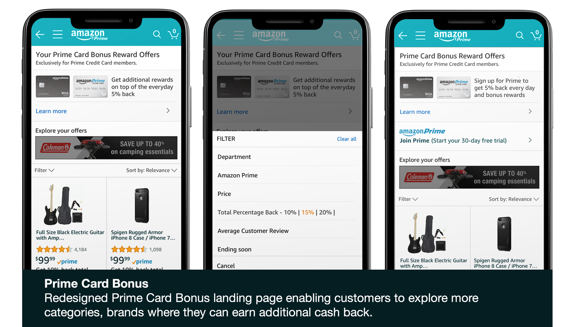
Redesigned Prime Card Bonus landing page, enabling customers to explore more categories or brands where they can earn additional cash back and create extra value across a wide array of products for the most loyal customers.
Project Overview
Prime members who pay with the Amazon Store Card currently have the option of receiving a 5% statement credit on all Amazon purchases. Now, these Prime customers can receive an even larger statement credit on select brands and product categories. As manufacturers expand restrictive pricing policies, Prime Card Bonus helps ensure Amazon is providing the best value for customers even when prices remain the same.
My Role
- Conducted interviews with stakeholders
- Conducted Design Jam session by to learn and collaborate on actual existing problem
- Setup a regular cadence with the engineering and business to prioritize the features
- Created wireframes and ran usability studies
- Designed high fidelity mocks
Customer Problem
Customers with the Prime Credit Card were forced to scroll far below the fold to access the promotions, as the prime real estate was occupied by large Prime Card Bonus offer banners. Customers who did not have the Prime Credit Card were shown how to sign up for the card, but were not informed about the promotions and the prime benefits they were missing.
Design Approach
I worked closely with my Product Manager and Technical Program Manager to accomplish the following:
I started to gather information of the program by reading the business requirement, browsing through the current flow, conducting in-depth interviews with business group, engineering team and UX team. Later, I did a competitive analysis to gain a better understanding of other cards in the market.
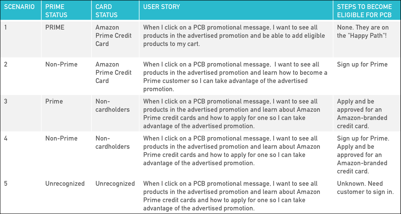
These in-depth activities helped me understand the different customer segments and scenarios while creating a user story for each customer. The user story facilitated my ability to communicate to stakeholders about the different customer segments, their steps to access the promotion, and what they were missing.
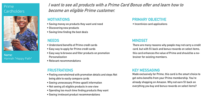
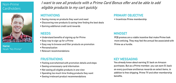
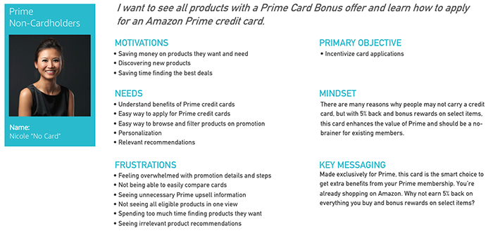
Based on the research in the discovery phase, I created three personas Hannah, Noah, and Nicole. These personas helped with finding the answer to the question “Who are we designing for?” Also, I was able to understand target users expectations, concerns, motivations and how these factors align to their goals.
User Story
Personas
Design Jam
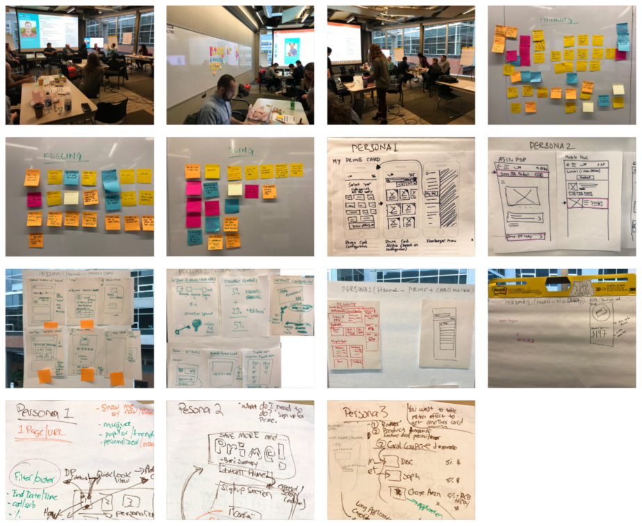
I took these details and conducted a three hour “Design Jam” where I invited Designers, Business, Engineers, and Marketing professionals together. We reached a total of fifteen members. I divided the members into five teams of three. I ensured that each team had a person from marketing, engineering and the design team; to encourage a variety of ideas and perspectives.
I started with a quick introduction, followed by a brain dump of the project by the Product Manager. Then facilitated a thinking, feeling, doing exercise, followed by each team ideating for each scenario.
The outcome of this session included:
- Deep understanding of the problem space
- Insight into how customers feel about Prime Card Bonus
- Alignment on project definition, scope and solutions
- Ideation & sketches
- A clear understanding of next steps and future progress
Design & User Testing
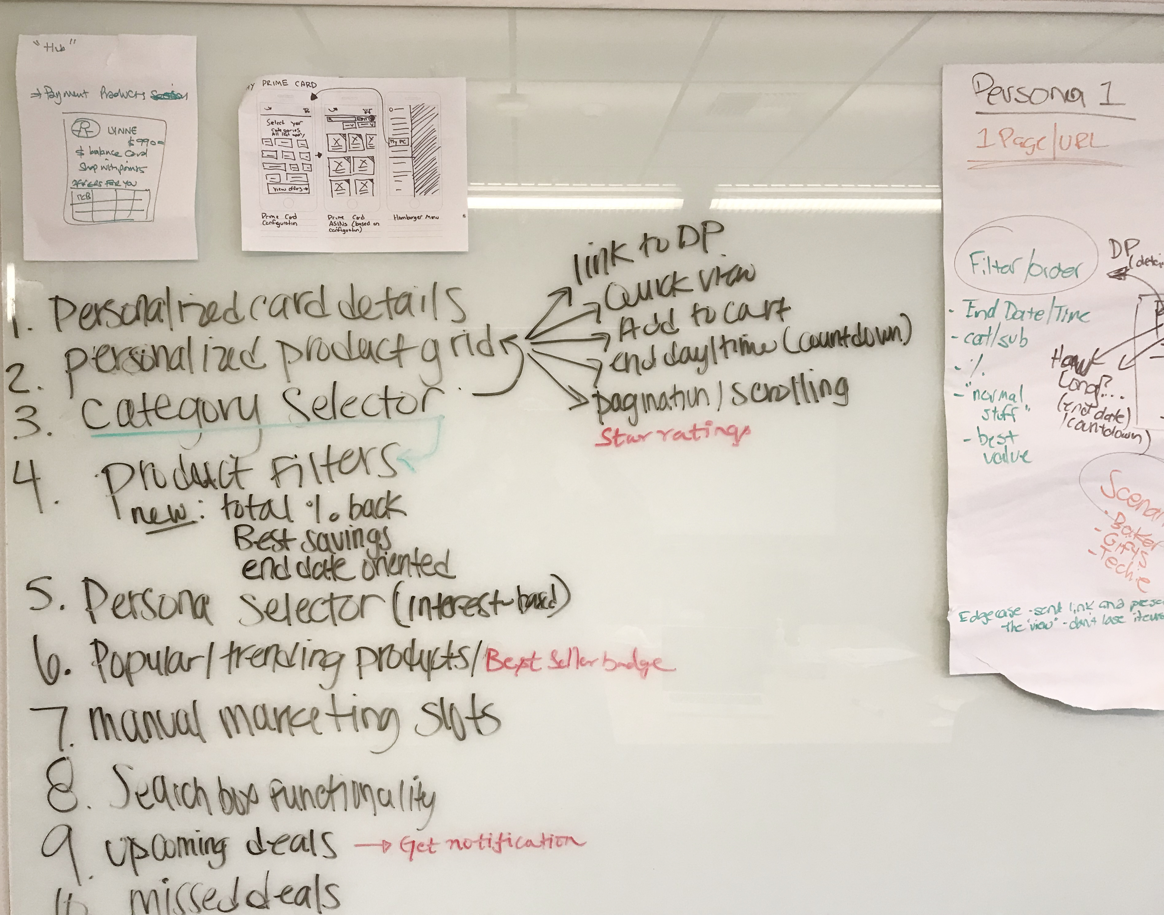
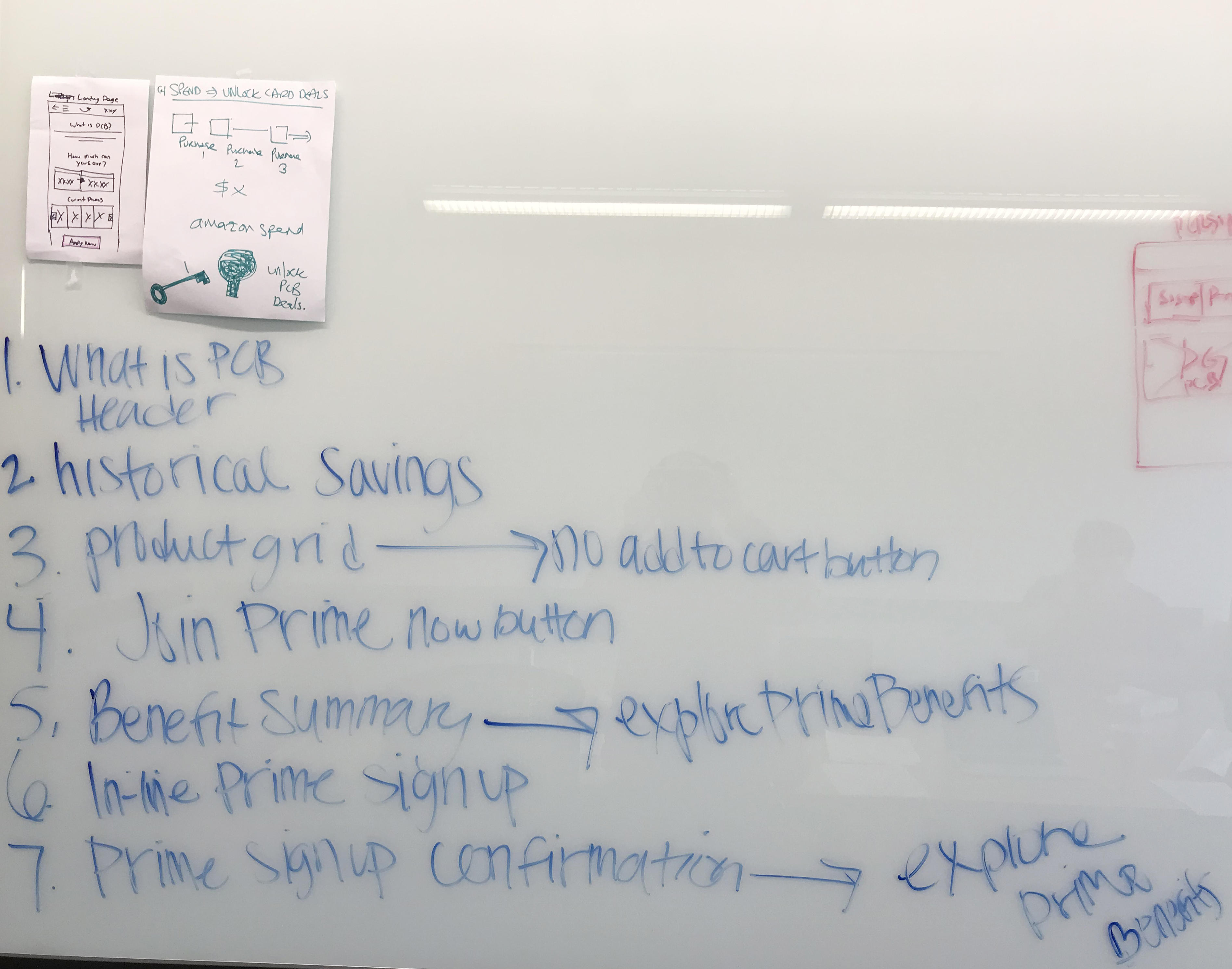
After the Design Jam, the ideas and sketches were validated against our business requirements along with the Product Manager and Technical Program Manager. The outcome of this session was developing prioritized feature and I was ready to begin the wireframes. I started the design in a collaborative manner by holding whiteboard sessions and translating them into low-fi wireframes. I then presented different explorations to the team and tested the designs on usertesting.com on existing users. Based on the testing, I made presented key recommendations to the team, received approval, and then started creating the mockups and redlines to handover the final designs to the development team.
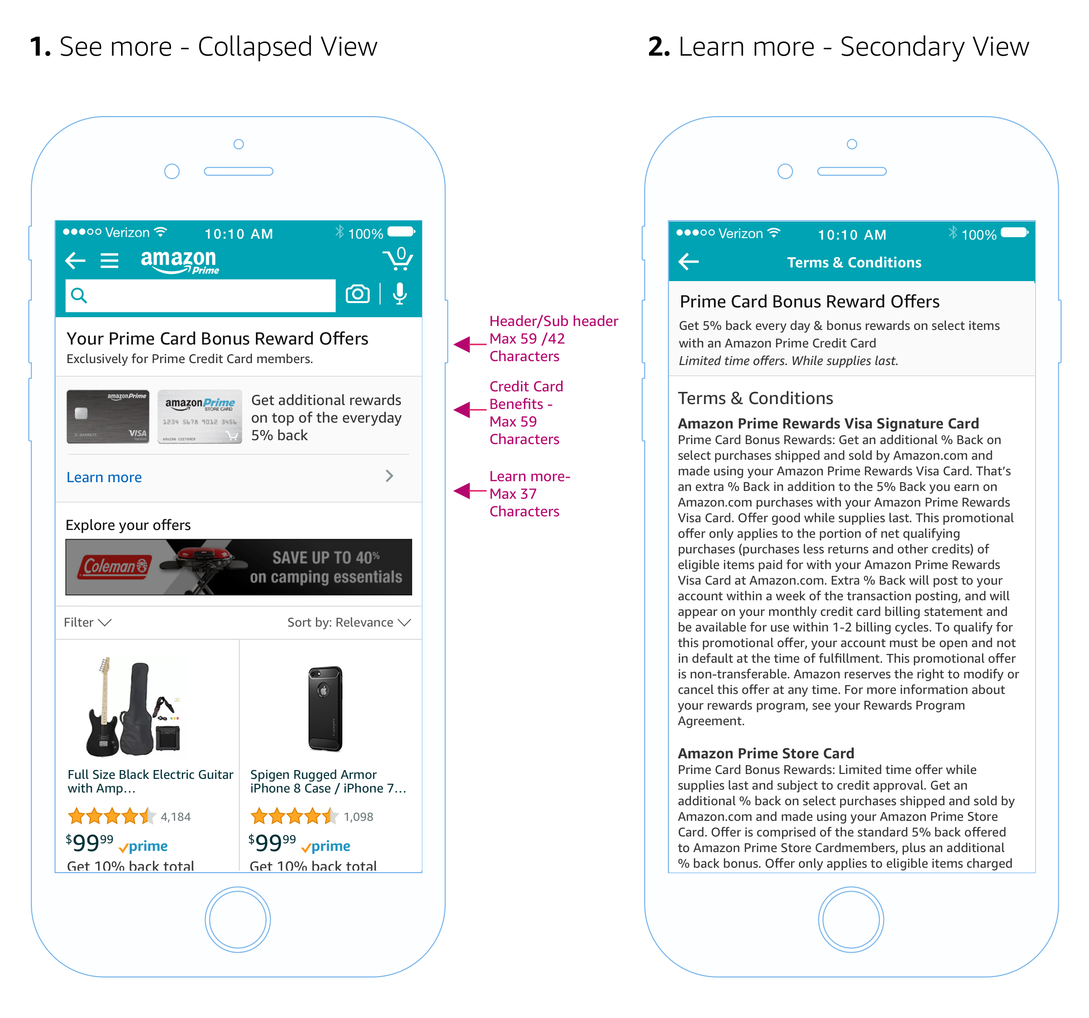
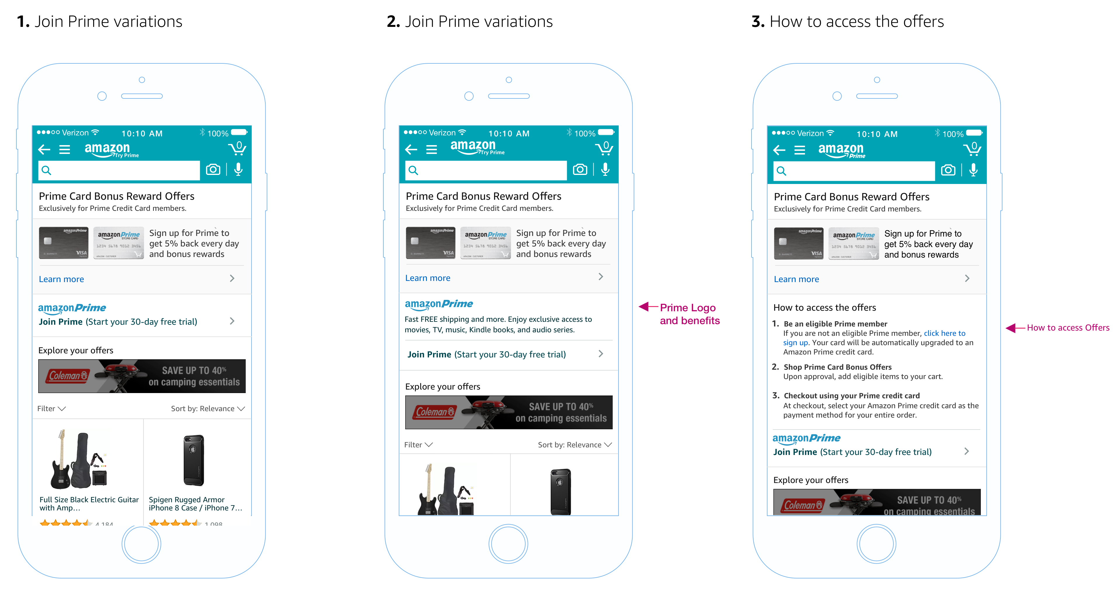
A few of those images are presented below.

Results
The new redesigned offering page was tested against the control experience (Control vs. T1 Designs). The new design had positive click through rates with over a 60% increase as compared to the previous design.