

Redesigned the current warranty experience by offering multiple protection plans to customers on Amazon mobile app.
Project Overview
The goal for this project was to enable protection plans as a paid subscription service which customers can subscribe to on a monthly or yearly basis. With current protection plans on the marketplace, customers are required to prepay for a fixed two, three or four year period at the time of purchase. W With the revised subscription/membership model, customers can start with a free or discounted trial of membership benefits , then pay a fixed rate of $x/month or $y/year per billing cycle thereafter.
My Role
I coordinated and led all phases of design including: information architecture, user task flows, interaction, visual enhancement, product, and prototyping. I also conducted user research using interviews, surveys, focus groups, and usertesting.com program.Customer Problem
Customers were required to prepay a fixed two, three or four year warranty coverage price at product purchase time. Consequently, this forced customers to buy long term plans and restricted price-sensitive and non-warranty buyers from making a purchase.
Design Approach
I started to gather information about the current warranty experience by running a survey of target users. After sifting through all of their feature requests, we were able to identify their key pain points:
- Price-sensitive customers were hesitant to buy long term plans, because they considered the value of investing in the item they were buying and how long they expected to keep it before upgrading to a new device.
- Do not offer non- warranty buyers and option to try the service for a short duration of time at discounted rate, before making a longer term commitment.
Key Features
- Enable non- warranty and price-sensitive customers to try the warranty for a short duration of time at a discounted rate before making a longer term commitment, by offering Subscription model.
- Offer customers an option to start with a free trial or discounted rate to try out the membership benefit on monthly basis– pay as you go and cancel at any time.
This enables businesses to retain the warranty buyers for a long term relationship through membership benefits, renewal discount, etc.
Our team identified the key features that had to be included in the current warranty option to improve the retention of existing warranty customers and increase the number of new customers. I mapped out user flows, based, and brainstormed performance enhancing ideas by white boarding.
Based on the user flows & brainstorming sessions, I designed different variations that provided a minimal level of difficulty accessing relevant information.
Once I drafted designs, I prototyped them in Invision and tested them on users with usertesting.com.
Offering Subscription & Regular Warranties
I started to gather information about the current warranty experience by running a survey of target users. After sifting through all of their feature requests, we were able to identify their key pain points:
- Price-sensitive customers were hesitant to buy long term plans, because they considered the value of investing in the item they were buying and how long they expected to keep it before upgrading to a new device.
- Do not offer non- warranty buyers and option to try the service for a short duration of time at discounted rate, before making a longer term commitment.
Design Ideas
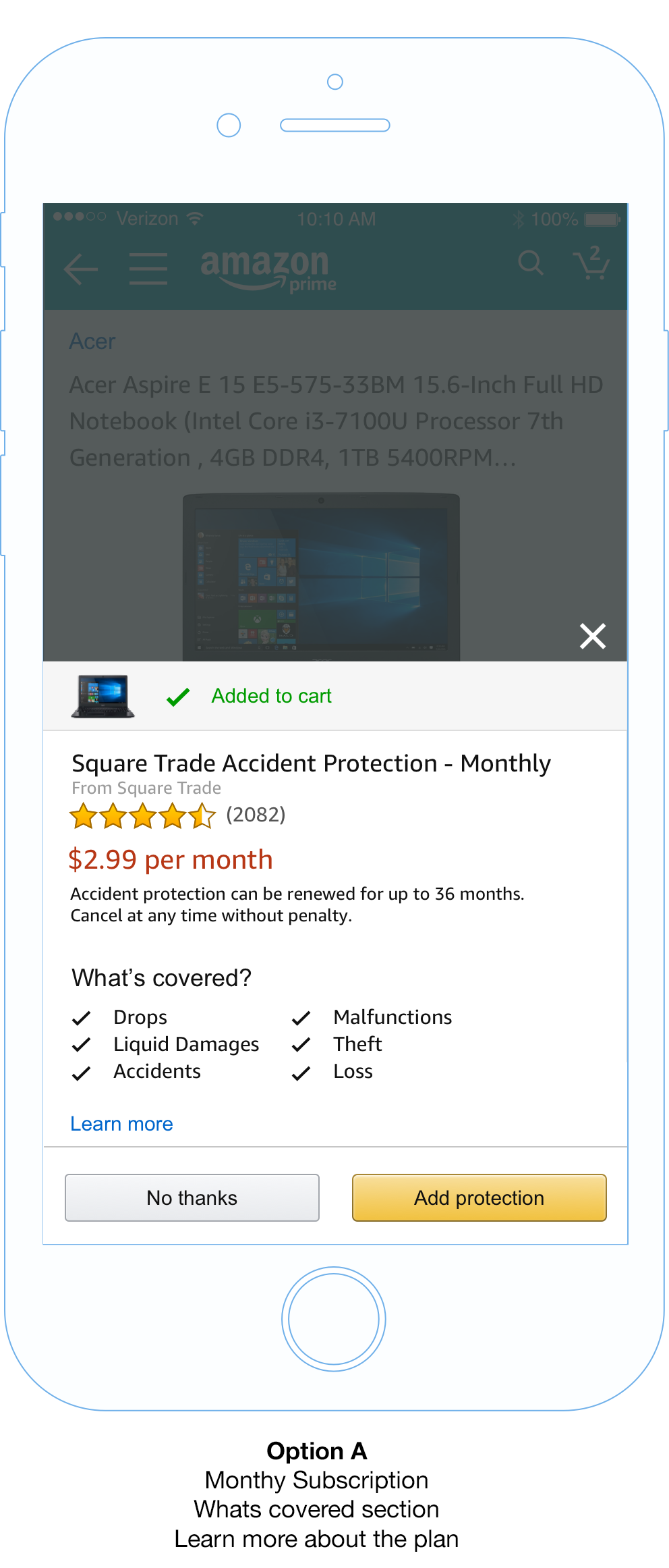
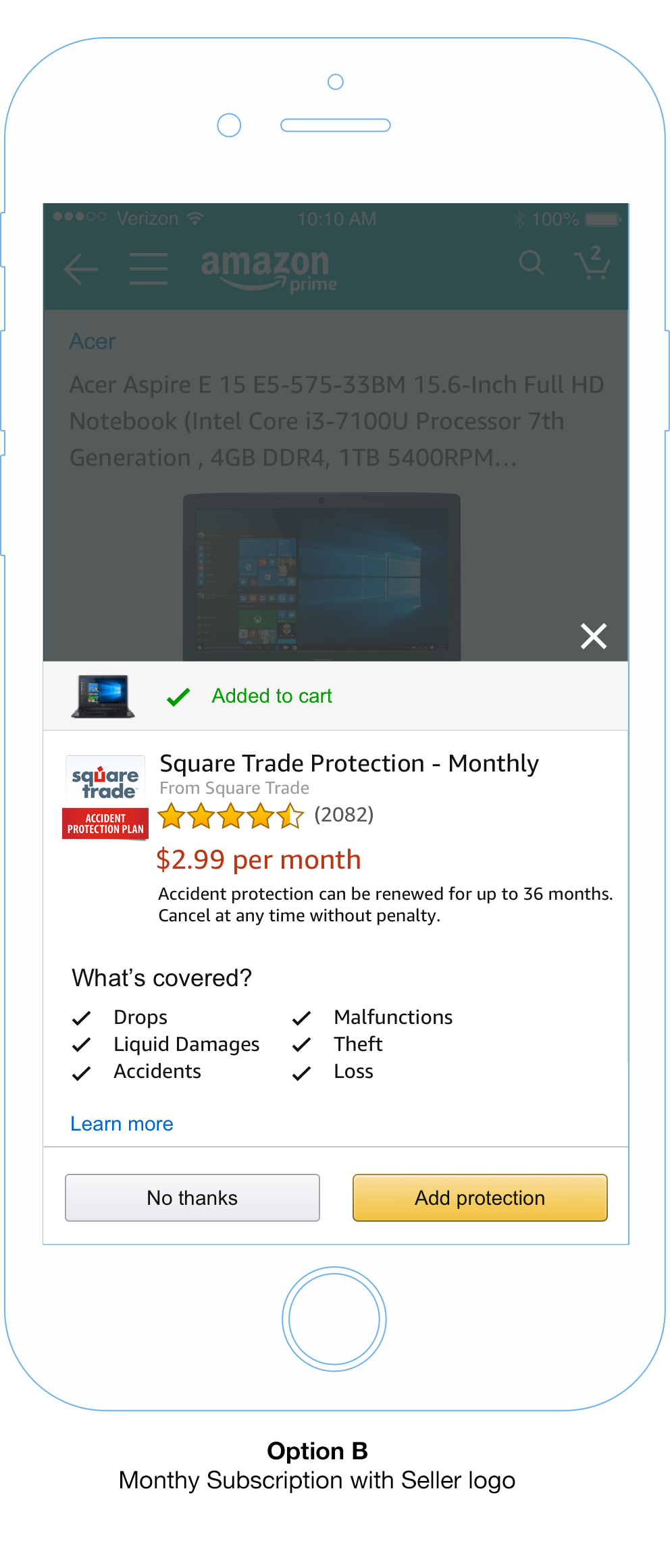
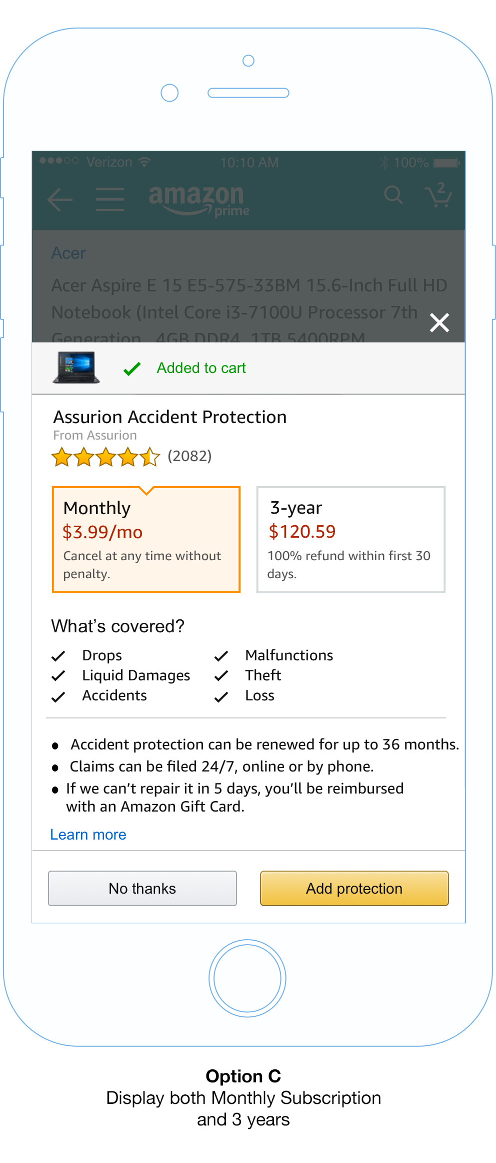
Offering Subscription & Regular Warranties
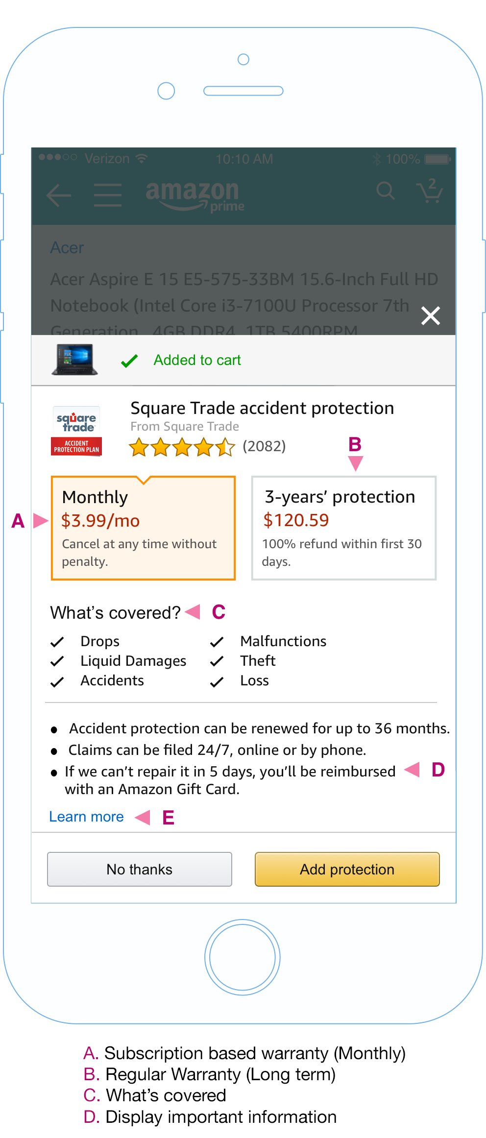
Offering both types of warranties in Twister:
By offering both monthly and regular warranties to customers, we are taking care of existing customers whom strongly consider warranty options for their purchase, while also serving customers who are price- sensitive, non-warranty type buyers.
What’s Covered
Displaying clear and detailed information about protection plans(including what will be will be covered)will help calm consumer fears.
Bullet Points
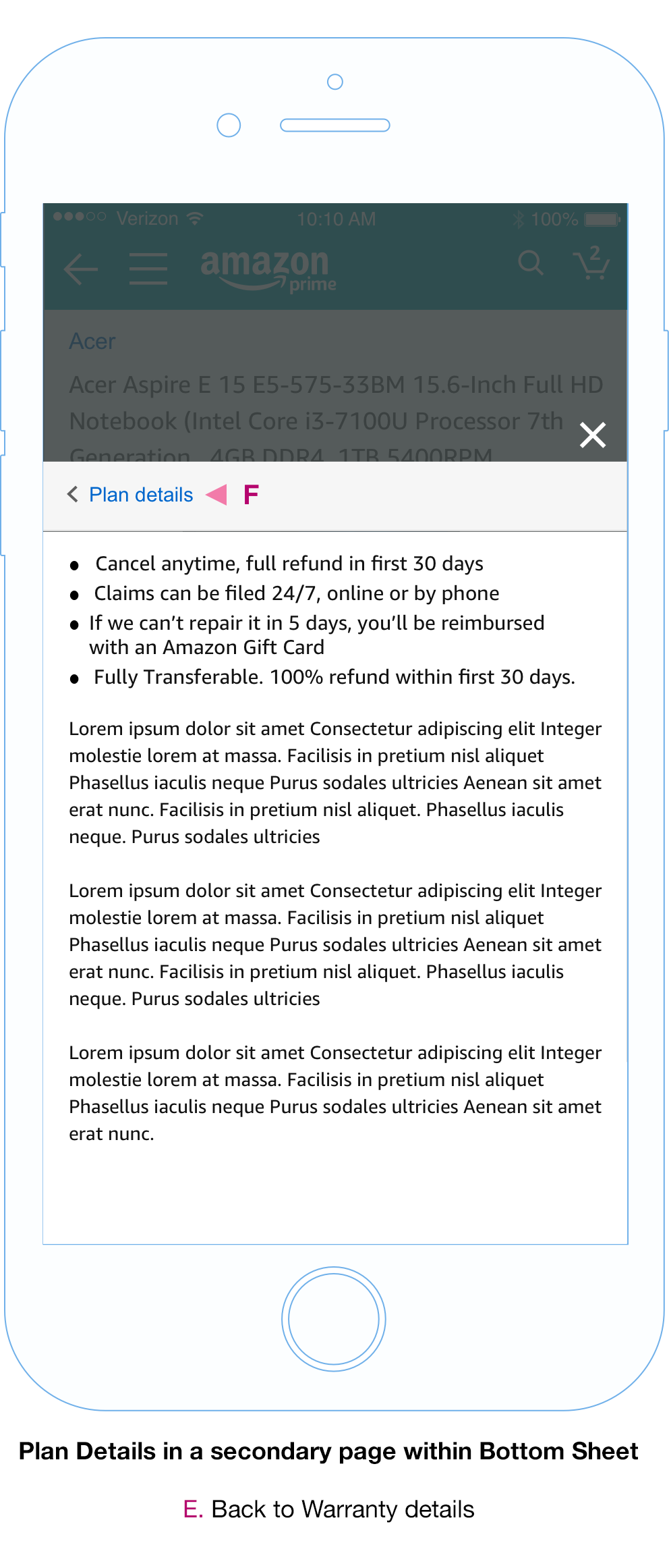
Highlight key messaging in the primary view without the need to navigate to secondary view.
Plan details
Offering more information on the plan helps build transparency and confidence in non-warranty buyers.
I performed a A/B test on the following designs and the outcomes were:
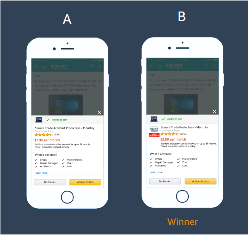
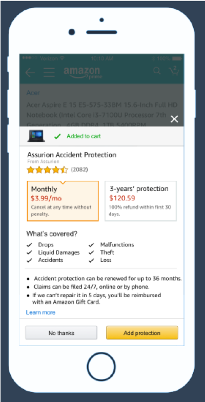
Test 1: Monthly Mobile:
All users were able to quickly point out the absence of the logo in option A. When asked about preference, users unanimously preferred option B, because users felt the logo added a sense of trustworthiness. Some users liked the cleanliness of option A, but primarily valued the logo in option B.
Suggestions
The language of “Learn more” was broad and did not seem to resonate with most users. Instead, consider changing the wording to “Plan details,” in order to provide greater transparency on what to expect when the link is clicked. The use of a logo will provide visual consistency between mobile and desktop versions.
Test 2: Monthly Mobile:
All users quickly understood the differences between the two plan types, but some users questioned the max duration of the monthly plan and wanted to know to the extent of the plan. All users understood that the monthly plan would cost more, but the positive side of being able to cancel the plan without penalty, made the monthly plan a much better option for most users. It seems that the older the user, the more likely they are to choose the one-time larger payment.
Suggestions
Consider adding the plan logos here for consistency across devices/experiences.
Change “Learn more” to “Plan details”.
Ensure visual consistency across all experiences (Desktop SI + mobile).