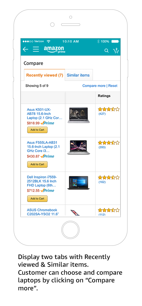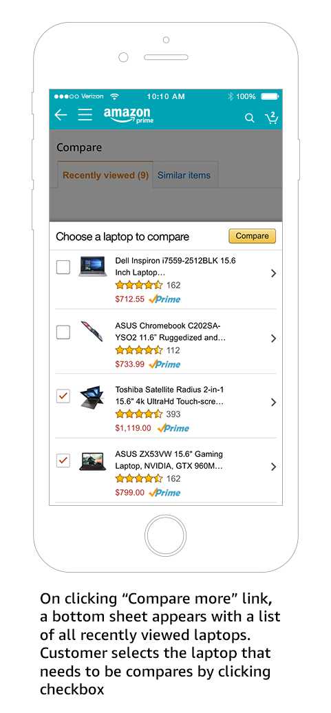

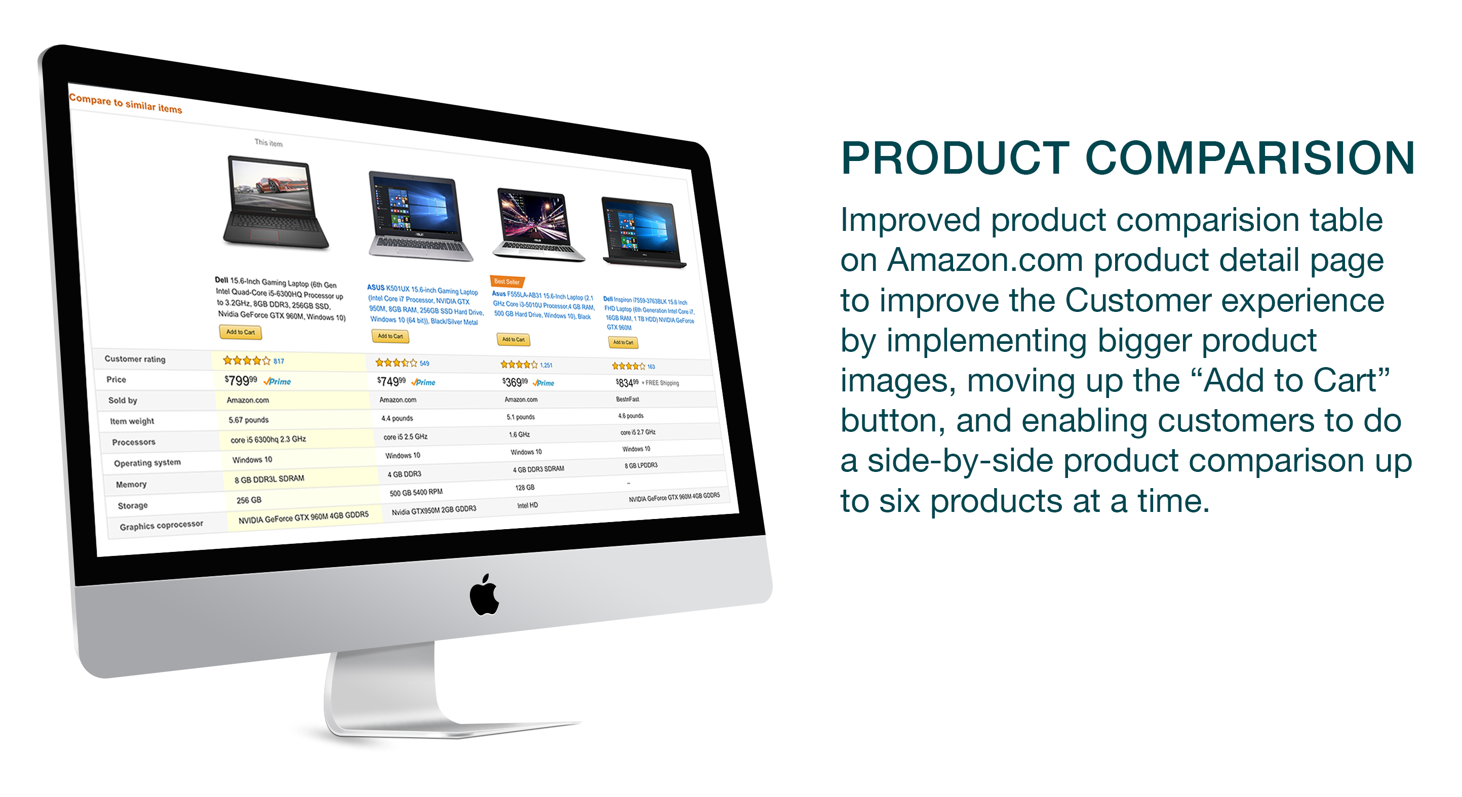
Designed product comparison table on Amazon Inc. seller platform www.amazon.com detail page in desktop to improve the customer experience, by implementing enlarged product images, relocating the “Add to Cart” button, and enabling consumers to utilize a side-by-side product comparison for up to six products; an addition of two, from the current model.
Project Overview
Product comparison is an essential part of the consumer shopping experience, especially when considering product variety on large scale seller platforms like Amazon. Therefore, we redesigned the comparison widget on the detail page to better assist Amazon customers with comparing similar products. All this in an effort to create a smooth and natural interaction in the purchasing journey and increase conversion, customer engagement, and traffic.
My Role
- Lead interviews with stakeholders
- Competitive Analysis
- Conducted Surveys
- Created wireframes and ran usability studies
- Designed high fidelity mocks
- Collaborated with engineering team closely until the launch
Customer Problem
Customers are able to compare the products, but are unable to make a shopping decision because of poor readability, smaller images and increased proximity to the “Add to cart” button, which functions as the sellers call to action. resulting in customer abandoning in the middle of their shopping journey.
Design Approach
This was my first project for Amazon, where I was tasked to enhance the comparison customer experience and reduce the number of shopping abandonments. I worked closely with my Product Manager and Technical Program Manager to understand the current user experience and determine where improvements can be made.
I gathered information by reviewing the business requirements, browsing the current experience, and conducting in-depth interviews with the business group and engineering team. Later, I performed a competitive analysis to better understand how other ecommerce sites are helping their customers feel secure in their shopping experience.
These research-based activities helped me understand the different customer scenarios and how a story is created for each user. The user story was essential to helping me communicate to stakeholders about the customer segments and their steps to access the promotion and what they were missing.
Competitive Analysis
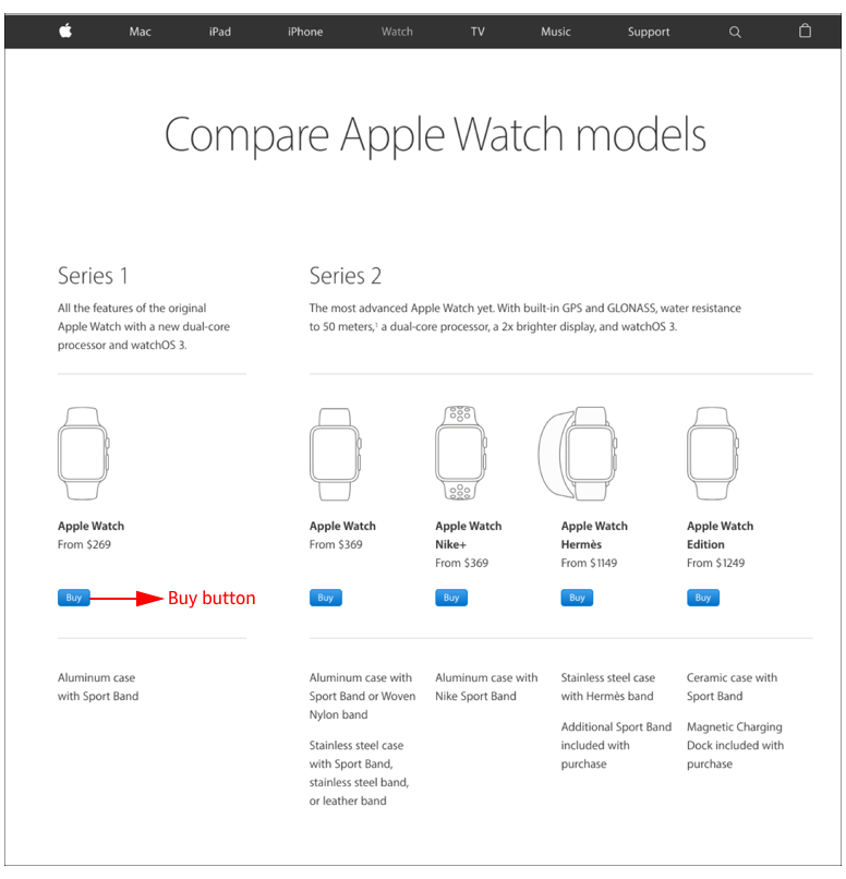
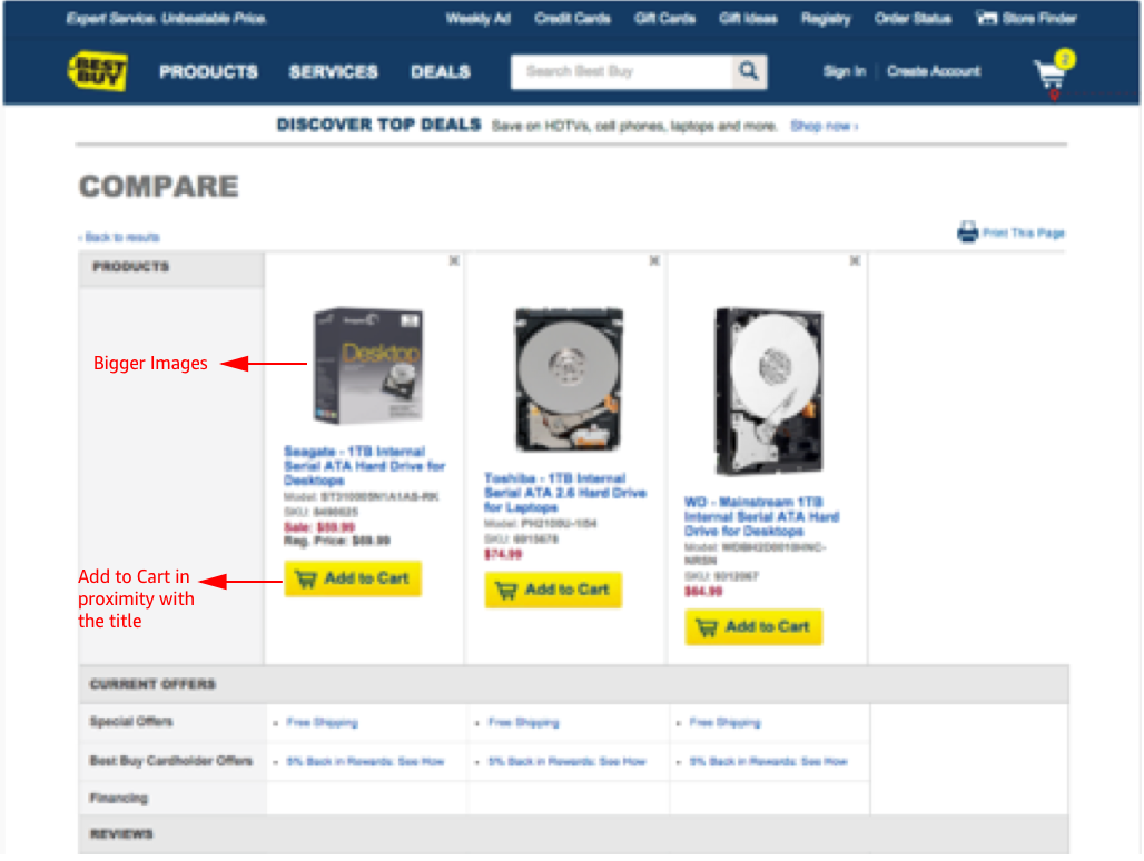
- Bigger product images help customers to engage with the comparison table quickly
- “Add to Cart” button should be in close proximity to the product image and title.
- Keep the text within the comparison tables short (avoid full sentences).
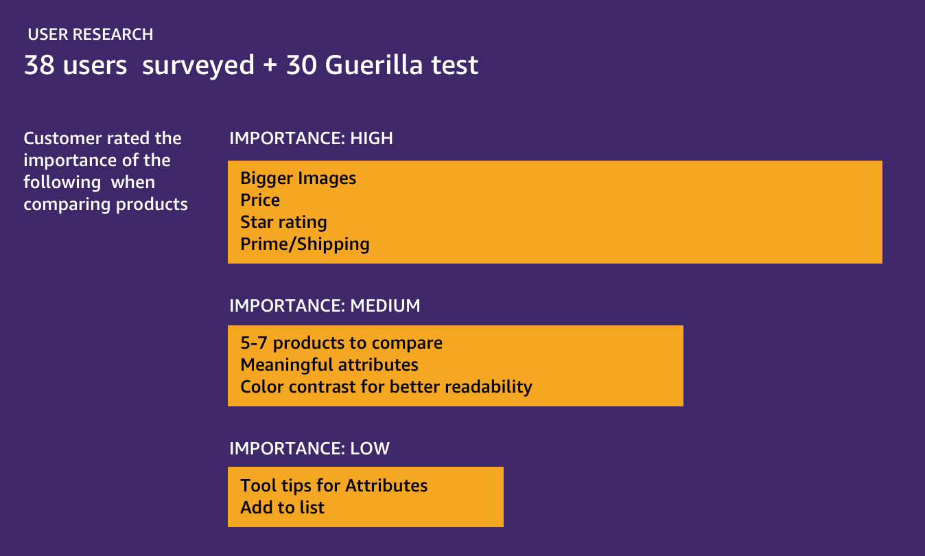
- Altering the color contrast will help with readability (Example: Alternate row color coding).
- Having fewer alternatives to consider (5-7 products) generally helps customers engage in decision making.
What I learned
User Research
Sketches
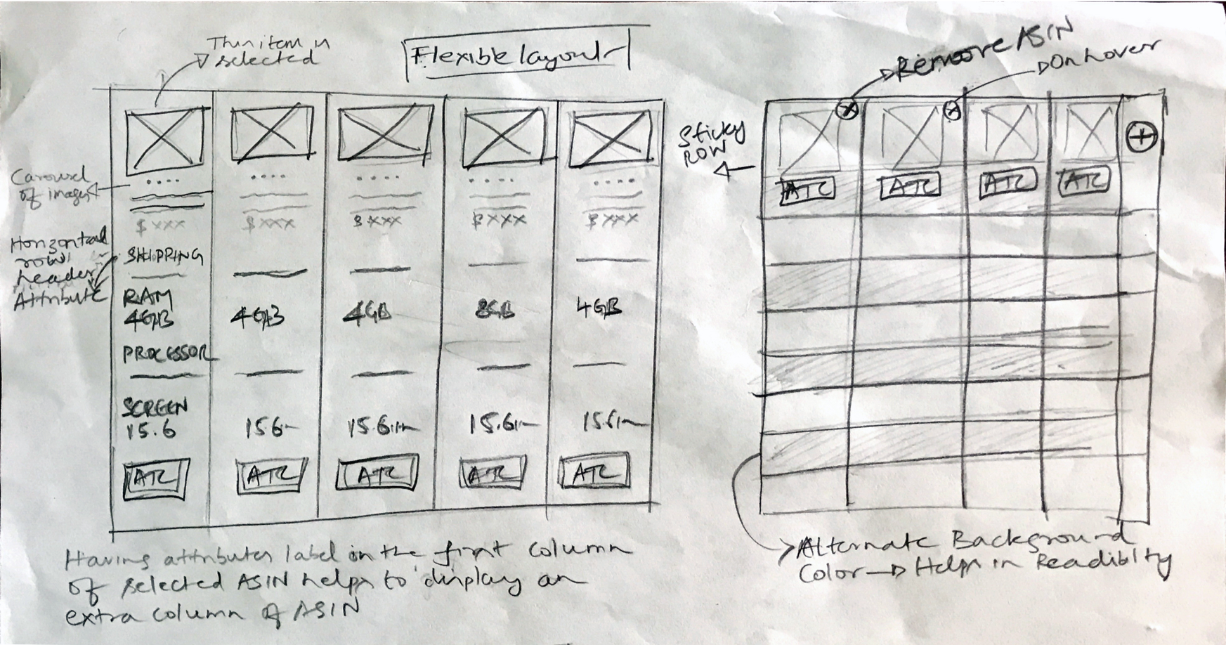
I started with lightweight sketches; exploring different ideas, then validated with select users and team members before creating wireframes.
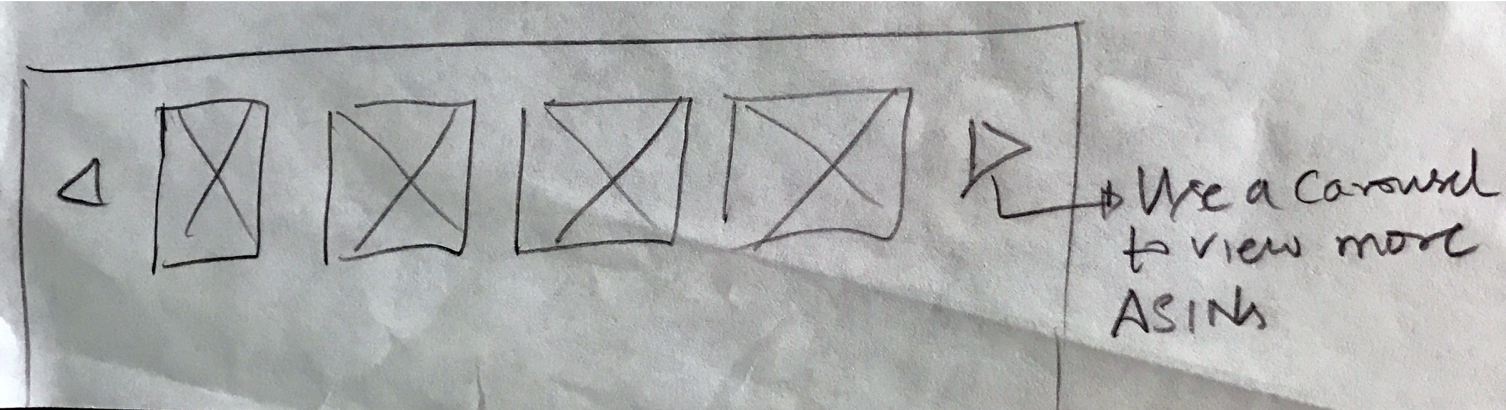
Low-fi Wireframes - Idea 1
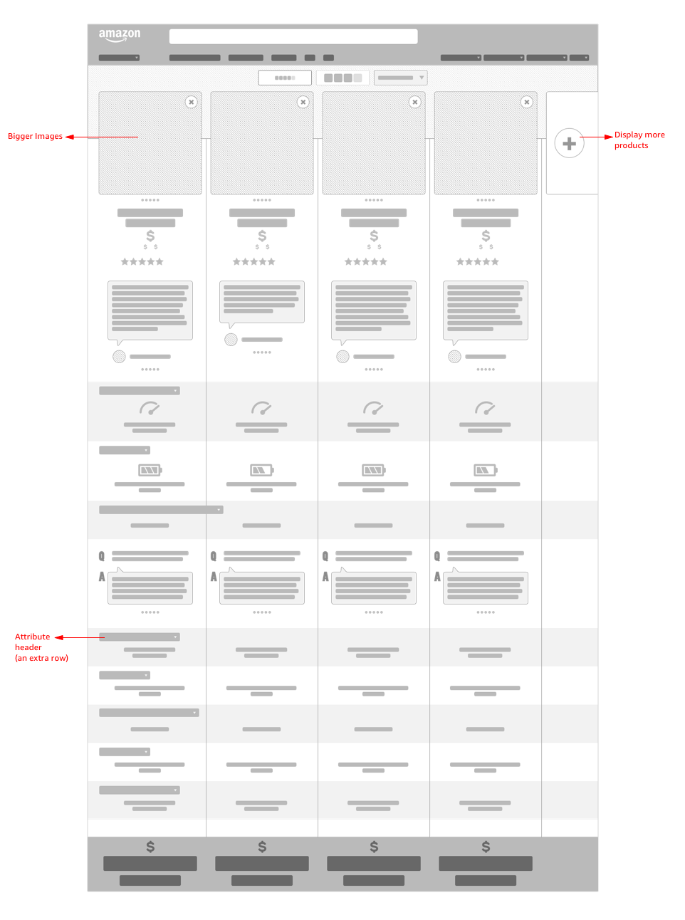
I performed a quick user test on this design.
Outcomes Include
Pros
Having attributes label in the first column of the selected product helps to display an extra column for a product.
Cons
Attribute label combined with attribute in first column left a cluttered appearance . This added to the cognitive load, which left users unable to process it efficiently. Products with multiple attributes such as laptops/cameras, tend to become lengthier. This led many users to miss the price and “Add to Cart” button at the bottom of the screen.
Low-fi Wireframes - Idea 2
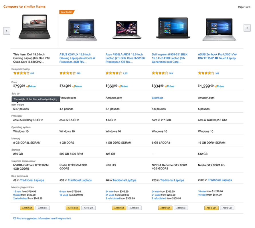
I performed a quick user test on this design.
Outcomes Include
Pros
Compare photos & ratings, additional row for best seller rank, manage tooltips
Tested with 10 Products
Pros
Attributes label in the first column of the selected product helps to display an extra column of product
Most customers noticed pages 1-4 (top right), but expressed that there were too many products making it harder to remember or narrow down their search.
Cons
Attribute label along with attribute in first column was very busy. This added a lot of cognitive load and users couldn't process it easily.
Customers were annoyed with the tooltips on attribute.
Product with many attributes such as Laptops/Cameras tend to have become lengthier and most users didn’t notice Price & Add to Cart button at the bottom of the screen easily.
Low-fi Wireframes - Idea 3
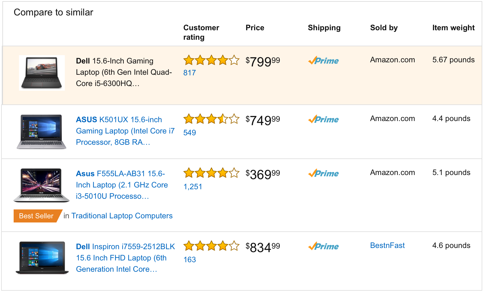
Flipped the comparison table with products in columns and attributes in rows. The design worked well when product attributes were less. However, when customers were shopping for products with more attributes, they were forced to scroll excessively, adding to their cognitive load.
Final Design & Redlines
Finally, I translated the wireframes to high fidelity design and created redlines for the developers to code.
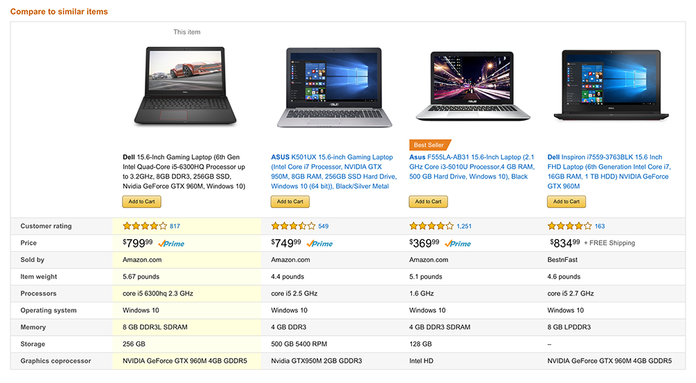
Redlines
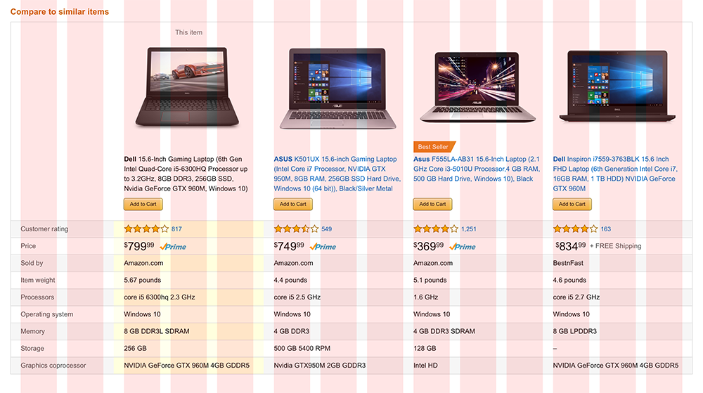
Results
We tested the new designs by doing an A/B test for 4 months from January 2017- April 2017 and launched the new experience in May 2017. The new experience showed a positive customer engagement with a 160% increase in revenue when comparing fiscal year 2016 to 2017. Additionally, there was a 100% increase in the click through rate or CTR, which details customers clicking on “Add to Cart” from the Comparison table.
Future Mobile concepts